
A common mistake many streamers make is designing their profiles based on their viewing experiences, which is typically on a large desktop or laptop screen. The reality, however, differs significantly. The majority of your audience is likely viewing your profile on a mobile device, around 70% to be precise, leading to a vastly different user experience than you may anticipate. A layout that looks clean and well-organized on a wide screen can turn into a disorganized jumble on a narrow mobile screen, potentially losing you viewer engagement and tips. StreamerSuite’s mobile-optimized profile themes ensure a consistent, professional, and readable presentation of your profile across all devices.
As a streamer, you probably review your profile on the same device you use for streaming – in most cases, a wide-screened laptop or desktop. You feel confident seeing your profile neatly arranged with graphics perfectly placed. Unfortunately, your audience may not share this experience.
Chances are, around 70% of your viewers are on a mobile phone, viewing a significantly different version of your carefully curated profile. What appears as a beautiful design on your laptop could easily turn into a cluttered chaos on a mobile device. This discrepancy is a common mistake many streamers make while setting their online presence and can be easily rectified with mobile-first design.
Mobile viewing has become significantly prevalent in the live streaming industry. Most data analysis platforms, including Chaturbate’s own research, suggest that 70% of viewership originates from mobile devices. This implies that out of every 100 viewers on your profile, 70 of them are likely on a phone or tablet.
Surprisingly, this shift towards mobile viewership isn’t reflected in how streamers design their content. Most streamers, about 99%, stream from a laptop or desktop computer. While this is understandable, given the ease of managing broadcasts on larger screens, it unfortunately results in a disconnect between the streamer and their audience.
When you view your profile on a large screen, the experience vastly differs from what most of your viewers encounter. Imagine creating a poster for a billboard only to find out that most viewers are seeing it on a business card. This very scenario plays out with your profile when viewers access it on their mobile devices.
Even if you aren’t personally using your phone to browse streaming sites, your audience’s behavior should guide your design choices. Mobile users often expect quick-loading, easy-to-navigate, and aesthetically appealing content. Therefore, your mobile profile layout should deliver on these expectations within seconds. Failing to deliver can result in losing followers, tips, and long-term fans.
Before revamping your profile, familiarize yourself with the mobile viewer’s experience. This can be achieved by viewing your profile on different mobile devices or using your browser’s developer tools to simulate different screen sizes. You may find that graphics that looked appealing on your laptop are ill-readable on mobile, and important buttons are not immediately visible. Understanding these issues is the first step towards a successful mobile-first design.
Despite the growing importance of mobile-first design, crafting a profile that works seamlessly on both mobile and desktop isn’t straightforward. Streaming platforms weren’t initially built with responsive design in mind, often providing a limited set of customization tools. But with a mobile-first approach, it’s possible to create a profile that’s visually appealing and user-friendly across devices.
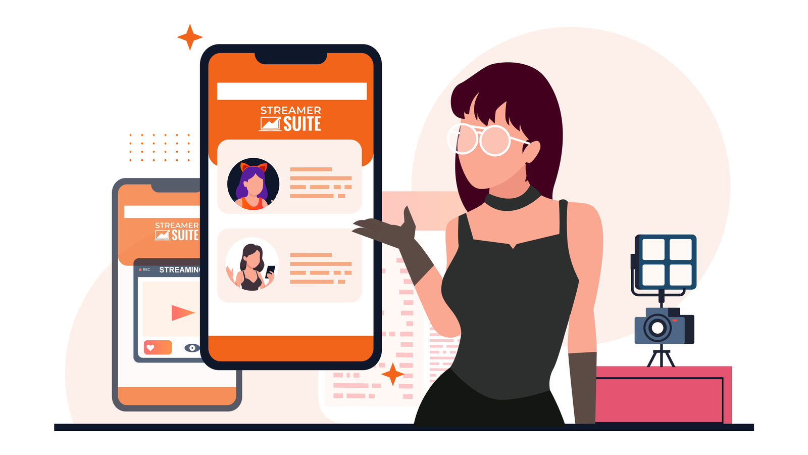
This is where StreamerSuite’s profile design service shines. StreamerSuite themes are fully responsive, automatically adapting to the viewer’s screen size. Whether a viewer is on a desktop monitor, a laptop, a tablet, or a phone, the layout is optimized for clarity and impact.
With a mobile-first mindset, StreamerSuite themes ensure that your profile is not just appealing to you, but also to the 70% of your audience who use mobile devices. This crucial difference can significantly impact your engagement, tips, and overall fan growth.
A mobile-optimized profile does more than just improve aesthetics. It enhances user interaction with your content, leading to increased engagement and revenue. However, creating a mobile-friendly design requires careful attention to avoid common mistakes, such as graphics that are too large, text that’s unreadable on smaller screens, and poor navigation.
StreamerSuite’s themes are designed to prevent such setbacks. But if you’re customizing your own profile, keep these considerations in mind. Remember that your profile is a living part of your brand that needs regular updating. Platforms may change their layouts, and trends in audience device preference can also shift. Regularly checking your profile’s appearance on various devices can ensure continuous optimal experiences for your viewers.
As a streamer, it’s crucial to realize that while you may create content on your laptop, the majority of your audience is likely viewing it on mobile devices. Designing with mobile in mind isn’t just a good practice; it’s essential to connect with the 70% of viewers who browse from their phones.
With StreamerSuite’s mobile-optimized themes, you can be confident that your profile will look great and work perfectly on both mobile and desktop. This allows you to focus on streaming, knowing your brand is making the right impression every time someone visits.
Remember, your laptop might be your creation station, but your mobile viewership is where you grow. Make sure your profile prioritizes them. Check out the mobile-optimized profile designs by StreamerSuite to see how they can help enhance your online presence.


Leave a Reply